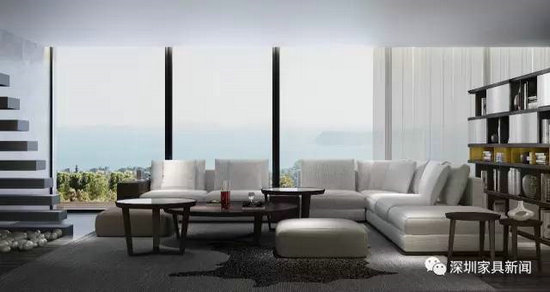
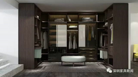
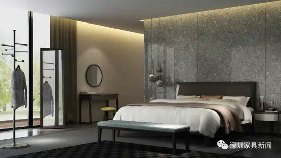
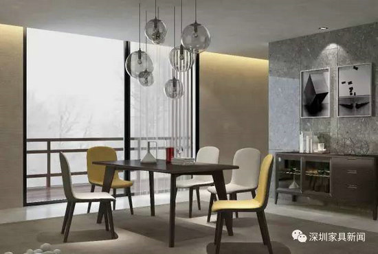
Bring together Furniture designers, paint designers, interior designers, soft designer, architects, fashion designers, art directors, directors and other professional-level masters related to aesthetics, combining home examples, from color art, painting Professional reviews of art, styling aesthetics, sculpture art, material art, etc., to discuss the trend of home life. Here is the Shenzhen Family Association Media "Sound Master Show" - In this issue, the product "Impression·Milan" series Brand Name: Impression · Milan (Renhao Home Products) Product style: Italian style, minimalist style Target group: middle-to-high-end consumer groups, aged between 25 and 50 years old, pursuing low-key luxury, paying attention to the fashionable people with exquisite simplicity and quality of life. product design: Impression Milan series products, exquisite and simple, revealing a strong sense of design, harsh quality standards will modernize the desire for space, color, materials, crafts, tastes and sublimation, compared to the simple Nordic style and heavy German style, Impression Milan is more in line with luxury or simplicity. In terms of design principles, Impression Milan extracted the most pure design elements of Italy, covering the most representative brand design essences such as clothing, automobile, architecture, food, sports and leisure. In terms of space layout, the impression of Milan is all-encompassing. Its simple style is casually matched with small Italian-style jewelry, which brings the characteristics of Milan's fashion capital into the interior design to create a high-quality home style. In the color selection, with white and black as the theme, a touch of blue in the living room is used as an embellishment. The simple and clean color matching naturally brings out the exquisiteness of furniture and accessories. In addition, the impression of Milan's romantic and casual appeal is in line with the slow adjustment of the sightseeing city. Urban office workers will be tired of fast-paced work and life. After 90 years of personality, they will be tired and feasting, singing and dancing. They will be impressed by Milan, a quiet, peaceful, bright and spacious home, eliminating the fatigue of work and forgetting the noise of the city. Big coffee reviews Design company: Shenzhen Furniture Research and Development Institute Design area: furniture product design Comments: The shape is straight, simple and succinct, easy to mechanize mass production; the details use the corner cutting method, the appropriate material mix (metal handle, soft cloth fabric, paint sheet, etc.), showing the overall style of exquisite fashion; The color matching is mainly black and white, with contrasting contrast and bright picture. The use of gray tones and striking solid colors to reconcile, make the home space appear layered, transitional order, and there is no lack of active fashion atmosphere; The series is composed of combination of board and wood, and the composition of the panel is based on urban youth. The functional size should pay close attention to the needs of small urban units. It can also expand the product's adaptability to space and people through the same two colors. surface. Review designer: Chen Dejian Design area: interior design Comments: The overall design is relatively simple. The design of the bedroom space is relatively simple, and the mirror is not suitable for the overall match of this space. It should be emphasized that the cabinet in the cloakroom should be illuminated without the door. If you add more diverse design elements to your youth space, it will be better to design more combinations. The design of the Coffee Table in the living room is relatively fashionable, and the combination of the shape is the popular effect. If the bookcase has more changes and more choices, the space will be more tonal. The material in the study suddenly has more metal matching, and it feels less consistent with the elements of the whole home. It may be better to express it with other elements. If the color has more matching or selection, the effect will be better. The overall home effect is good, more colors can be matched, and the space will be more flexible. Review Designer: Huang Guanglong Design company: Singapore Huang Guanglong Design Co., Ltd. Design area: interior design furniture design Comments: In the restaurant, the furniture and lighting are mainly curved, and the other decorative elements are slightly wrong with the linear elements. If the space and the painting have more curved designs, the home effect will be more prominent. In the living room, the decoration of sofas, curtains and windows is great, and it is the classic decoration and layout effect of Italy. In the bedroom space, the mirror and the bed are placed opposite each other, which is not in line with the home feng shui. On the lighting, there are too many ceiling lights, which are more suitable for public areas. The color of the two or three light sources is natural and the focal length is on the stage, which is better. Review designer: Zhang Sha Design company: Jane JIANMO to simple design Design area: furniture product design Comments: The overall color is harmonious, warm, elegant and stylish. From the product itself, the shape is refined, but the details are also revealed. The fineness of the wood, the fullness of the soft body, and the embellishment of the colors can all be interpreted in the form and meaning. Simple lines, bright color schemes, and a relaxed atmosphere. It is also the best interpretation and interpretation of the luxury lifestyle. The overall situation is strong, and the matching of the accessories is slightly trivial. For example, the hanging picture of the restaurant area and the youth area can be considered with a large volume of pendants. This visual experience will be more integrated, and can also form a delicate and streamlined product. Forming a contrast, echoing the brand concept. Review designer: Fang Lei Design company: 壹 design ONE LIFE DESIGN soft design agency Design area: interior design soft design Comments: Overall, the spatial relationship is smooth and the rhythm is bright. The space is very transparent, the color is light and modern. The texture of the material is just right, and the overall space is designed to be complete. The designer combines the interior space with the outdoor landscape, using large windows and doors to extend the outdoor natural scenery to the interior. The freedom of people's flow lines in the design makes the space rich in multiple levels of change. The space is dominated by gray and white, with dark wood furniture, and the color contrast of the furniture fabrics to embellish the personality of the space. The soft furnishings have been "more than chaos, less and not empty", and it is very good to grasp the combination of materials, colors and shapes between furniture and accessories. Review Designer: Li Qien Design company: Shang Ce Design Consultant Li Qien Interior Design Studio Design area: interior design Comments: This set of pictures is mainly a minimalist Italian style, with a strong unity and a comfortable feeling. When you look closely, there is still room for improvement. The minimalist design of the sofa is more functional, which is more in line with the modern family. For example, the L-shaped combination large sofa can be freely equipped with a small coffee table or a small layer board and a few books on the back of the chair... The lighting is easy to choose and meet the design sense of space, and it is more accurate. The design of minimalism is more difficult to grasp, because simplicity is not simple, using simple lines to bring out the beauty and style, and to make special efforts in proportion and detail. The matching color can be bold, pure black or warm gray is the best main color, but can add a personalized color to make the furniture more vital. In the picture of the bookcase, the door panel is turned into burgundy, sapphire blue, or yellow (must have a single color), and the simplicity is not so monotonous. Bookcases can actually have more color matching options, so that products have greater competitiveness in the market. Review designer: Zhu Yiyi Design company: Guangzhou Aomu Decoration Design Co., Ltd. Design field: soft design, hard design Comments: Living room space: The overall feeling of hard work is to use the point surface as the space background, and the overall furniture and soft clothes have more room for play. In terms of furniture styling, the sofa uses the simple and modern style of the atmosphere as a highlight, with a multi-layered but different height of walnut-colored coffee table as a color precipitation. There is a storage cabinet on the right side of the sofa, and the yellow color is used as the brightening color to make the space black and white gray tone more vivid, and the design idea of ​​“less is moreâ€. Restaurant space: Designed to meet the living habits of young people, abandoning the traditional color of the Dining Chair, the yellow and white are active in the spirit of the entire space. With a translucent glass ball chandelier, the space looks more polished. Master room: the extension is less is the design idea, the bedside chandelier as an extension of the space, the furniture has a simple and prominent style, such as the diamond shape on the back of the bed and the details of the rest of the furniture, to make the space look More refined, the fabric uses plain colors, such as rice tones, earth tones as the keynote. The matching walnut color of the furniture makes the space look more spiritual and bright. Review company: Valspar China Resources Coating Color Research Institute Design area: furniture painting Comments: Style positioning - Italian style. Impressions: exquisite, simple, stylish, comfortable Style interval positioning: Space color matching: with the classic achromatic black and white ash as the theme, the high-purity and bright yellow is used as the embellishment, the strong commonality is weakly changed, and the clean color matching echoes the simple lines of the furniture to create a refined and comfortable home style. Furniture color: The color matching method mainly dominates the color matching, the low purity medium black walnut color, slightly translucent gray tone, with pure white and high purity bright yellow, emphasizing the layering and jumping sense of color. Simple and not monotonous, giving the furniture a bright touch. Painting effect: Walnut is a high-quality furniture substrate, dignified and stable, and the texture is clear. Through the matt semi-transparent process, a little open and shading, no complicated process, maximizing the clear texture and transparent texture of the walnut itself, reflecting the natural texture and value of the wood, rich in sensory effect, level Strong feeling. Editor in charge: Liu Bing Furniture If paintings are used to appreciate, fashion is used to wear, then furniture is used to experience. Today's furniture, long beyond function, has become an artistic ornament, not only can be used to decorate the environment, show style, and even change the environment of life, affecting our mood every day. And this, is the charm of design. Practical Bedroom Furniture,Bedside Table Furniture,Multi-Layer Bookshelf Locker,Laptop Table On Bed vchomy , https://www.ivchomy.com